Belcor
Date:
June 2016
Client:
Belcor Const. & Dev’t Corp.
Belcor is an emerging real-estate development and construction company in the Philippines. As a newcomer, they needed a unique brand identity. Something that will strengthen their presence in the industry, will compete with well-renowned real-estate companies, and become credible and trustworthy.
They wanted their logo to represent their company’s mission. One that would stand out in the market. Simplicity, modernity, and boldness are just some of the qualities they wanted to see on their logo.
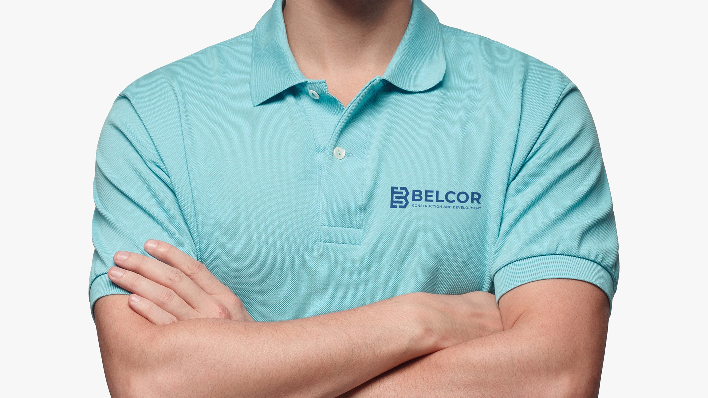
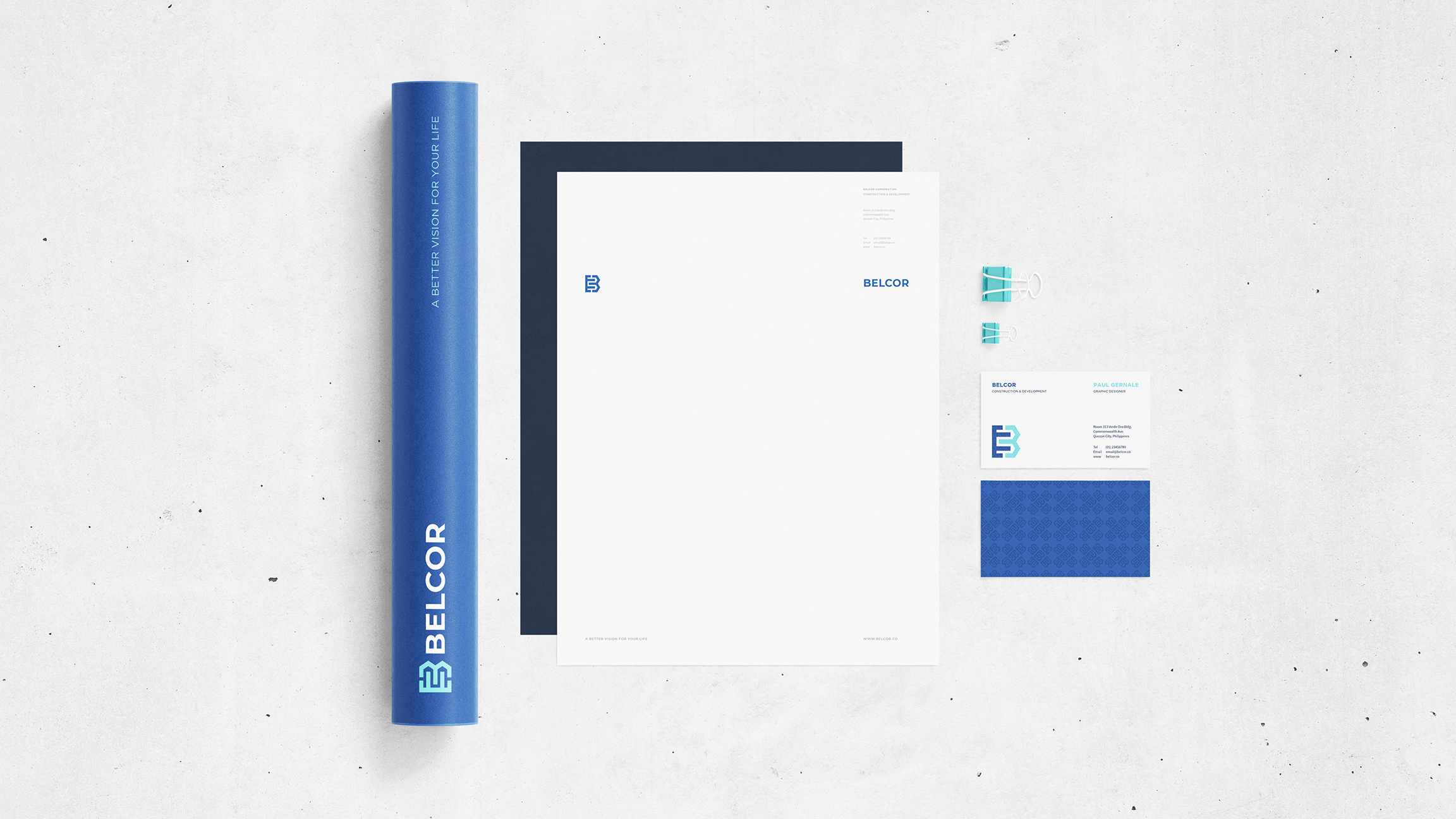
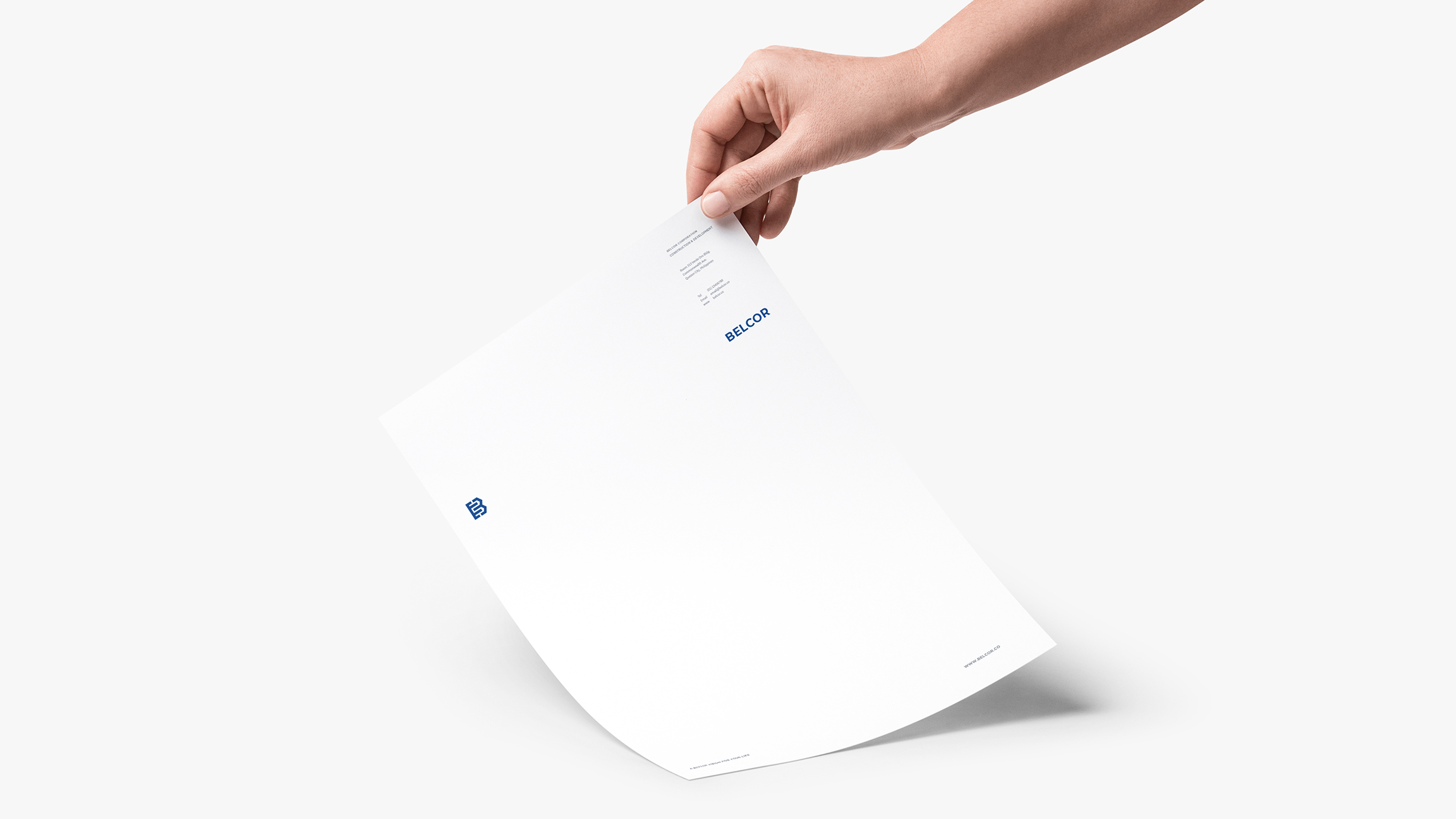
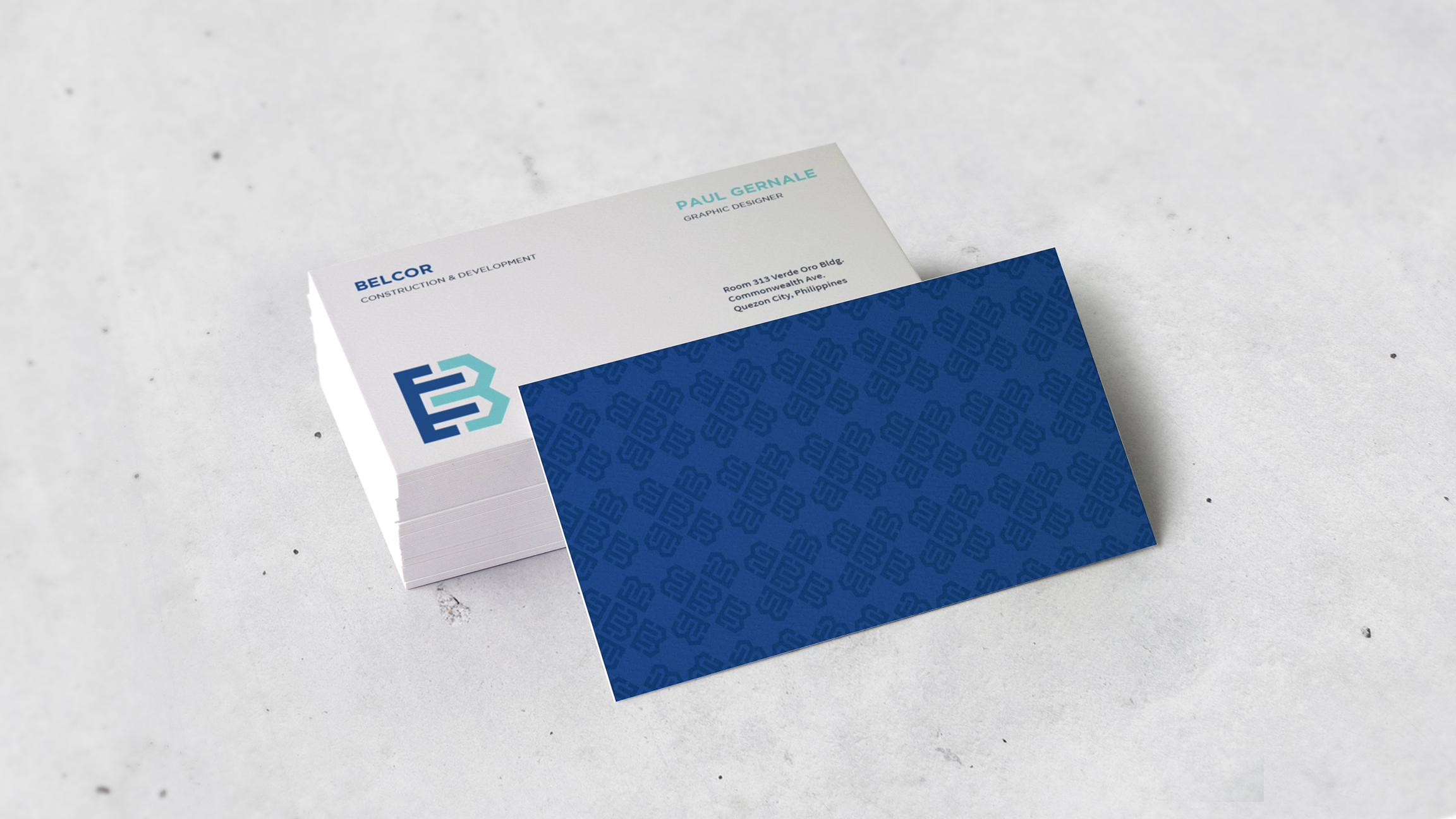
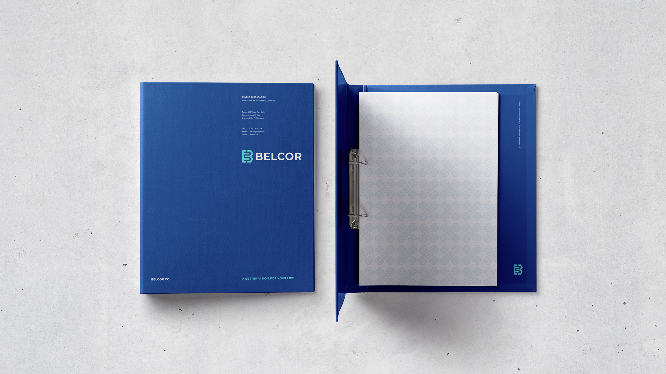
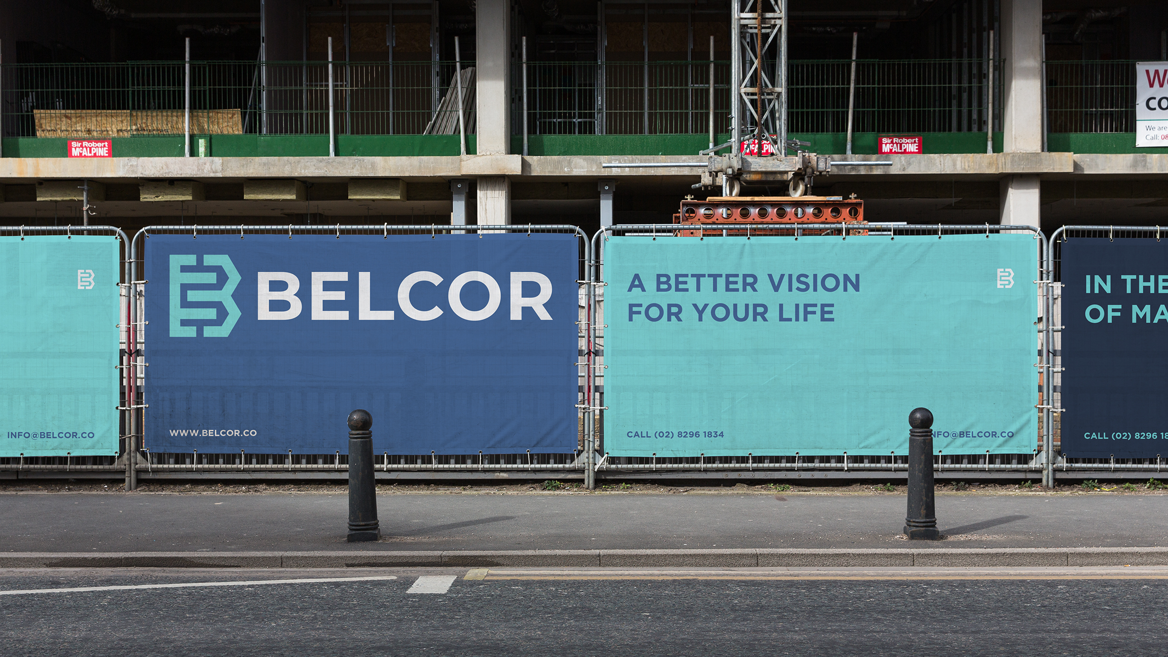
I created this particular design as one of their options. Eventually, I added a variety of collaterals to test and implement the visual elements that I designed.

My design was inspired by the construction materials such as concrete, steel, cement, metal, and more. What caught my attention was the technique that most people do in construction, and that is the process of building the steel frame. The steel frame is one of the most essential elements of construction as it serves as a skeleton that supports the floors, walls, and roof of a building and helps it stand strong.
Just like the company and its brand, it must have a strong identity to become reputable.
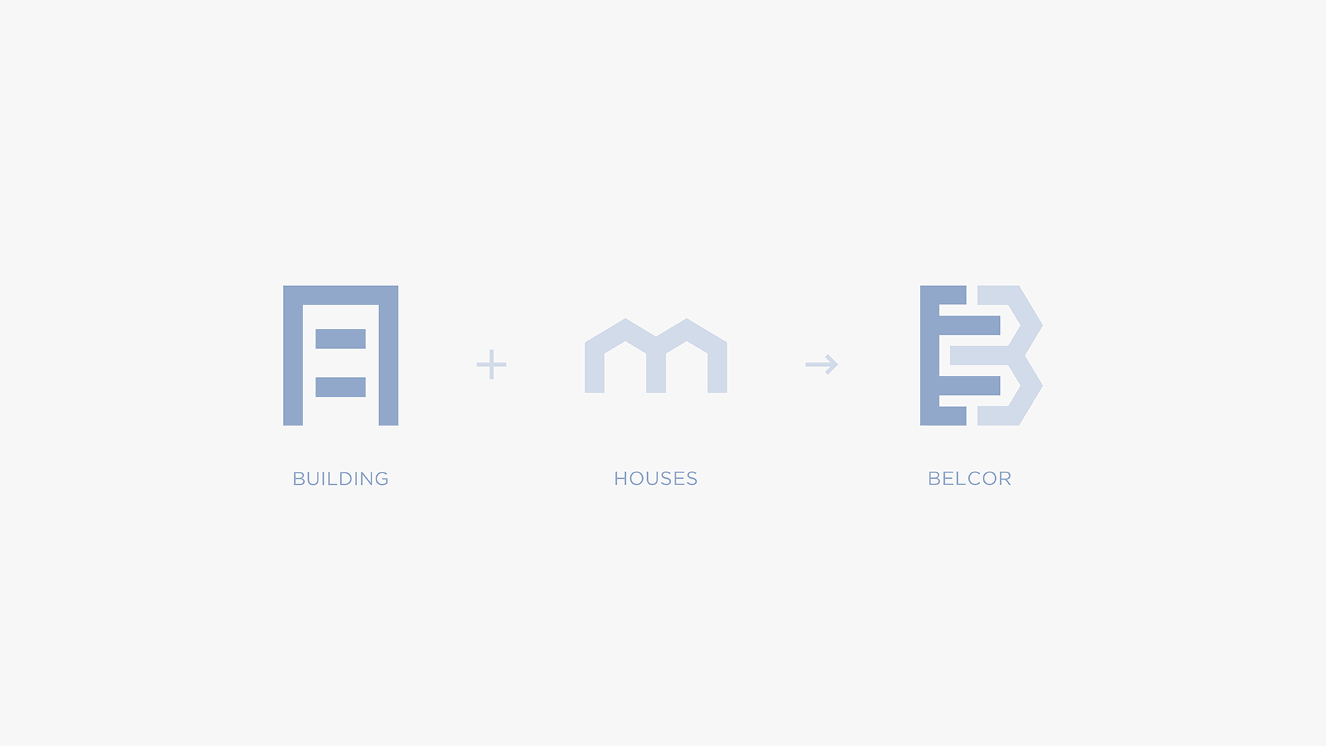

I drew some shapes that resemble the parts of a structure and I combined them to form the company’s initial. I made the symbol neat and simple but bold to focus on the actual letter it’s trying to form. I believe it would help a lot for the name of the company to have great audience retention and to stand out among its competitors by highlighting the company name’s initial.
My inspiration came from the process of combining the construction materials to build a strong and unified structure. I also used the steel framing technique that shows the vertical steel columns and horizontal l-beams to show the symbols’ entire skeletal frame.

I created a color palette that looks cool and fresh. This palette is inspired by the color of the sky. If you look at a structure on a worm’s eye view, the color of the sky serves as a stunning background which creates a beautiful image that highlights its subject. These colors also symbolize trust and reliability, the two most important qualities in the real estate and construction industry.
I used a simple geometric sans serif typeface to match this symbol. The Gotham typeface was created by Tobias Frere-Jones, an American type designer. I picked this font due to its round near-circular curves and the balance it gives to the overall look of the logo. Additionally, I also liked its versatility. Aside from using it as a part of the logo, it’s also perfect for headlines and subheads.
Apart from its geometric nature, it also has a human touch which when placed beside the Belcor symbol, would represent the hardworking people behind the company.
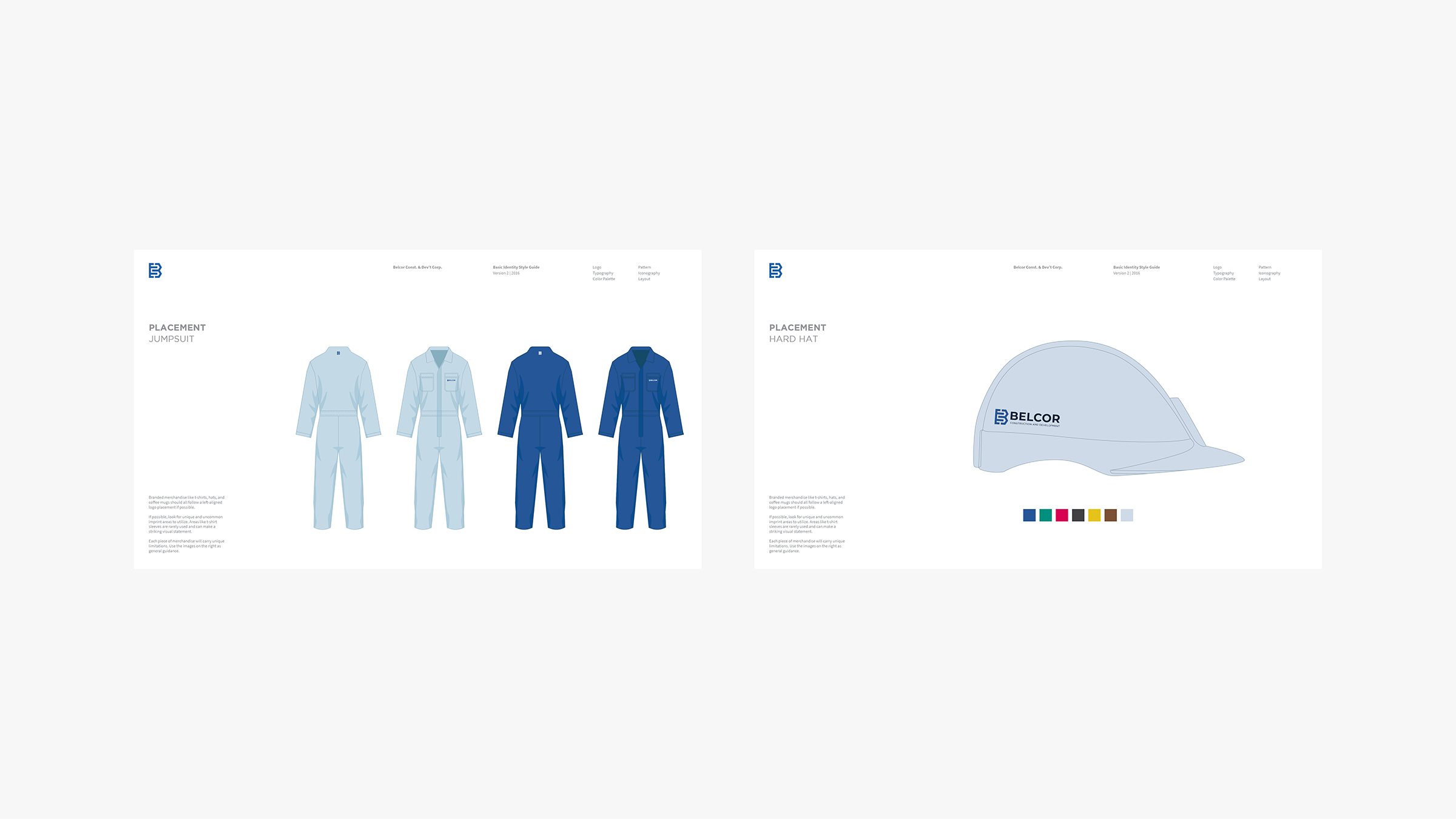

I also created an icon set in the design tool kit that can be used in various print and digital materials or platforms such as labels, signages, flyers, mobile apps, websites, etc. I patterned its style with the symbol’s features to keep the logo’s distinctive identity. This way, the elements look more consistent and uniform from the logo up to iconography.