JASCO
Date:
August 2013
Client:
JasCo
JASCO is a personal project for a local autoshop, also known as a ‘talyer’ in the Philippines. JASCO is a small business in an area where auto shops, or ‘talyers,’ are common. To differentiate itself from its competitors and attract new and younger audience, it must have a strong and distinct visual identity that is perfectly aligned with their history and legacy.

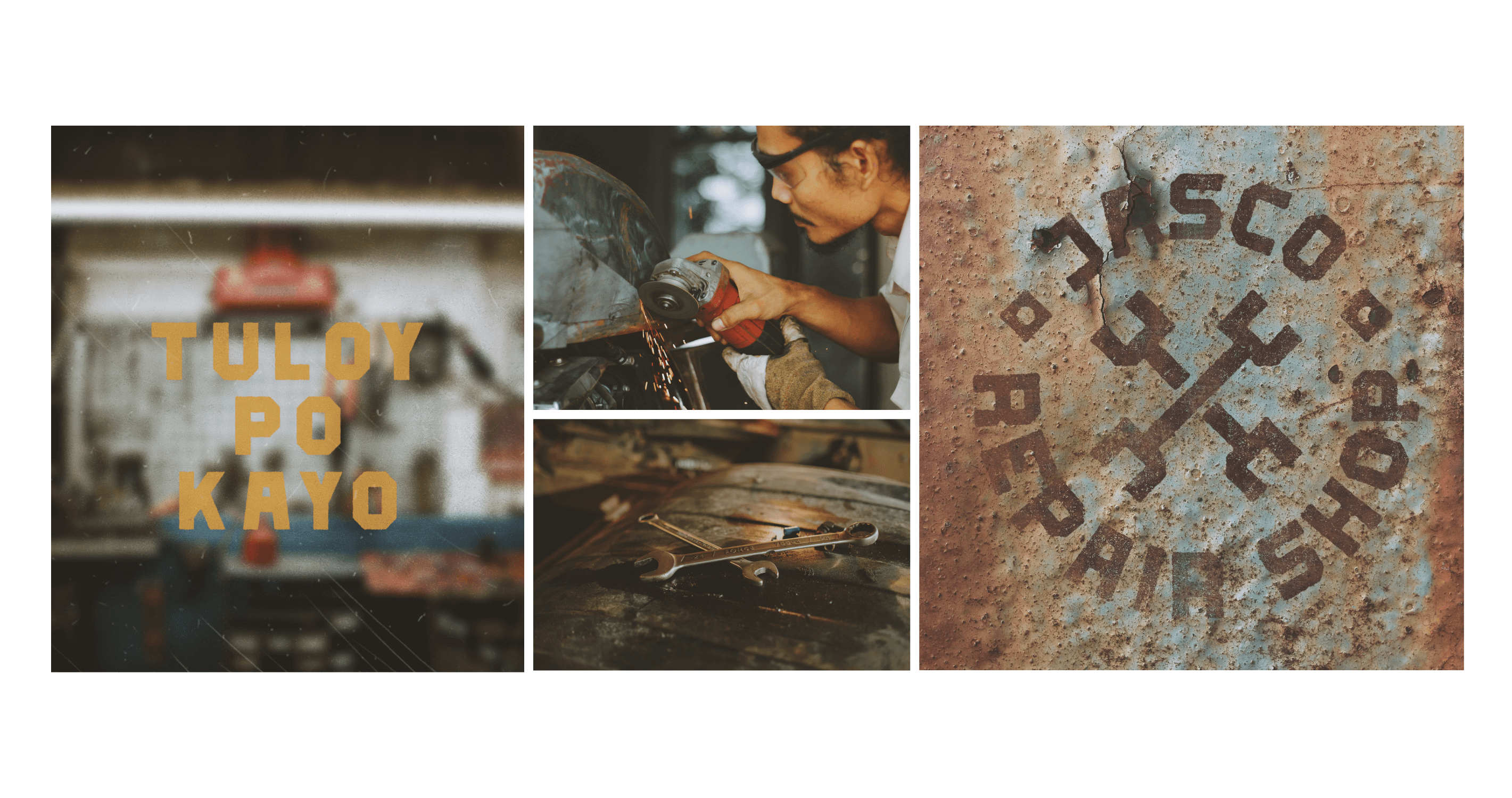
JASCO began in the bustling streets of San Andres, Manila, providing quality repairs and services to the local jeepneys. Their mission is to keep the Filipino jeepneys running smoothly, ensuring safe transportation for the people and a steady source of income for the drivers.
JASCO continued to grow. Their small and humble garage has become a trusted place for car enthusiasts, owners, and drivers from all walks of life. They became a destination for people who wanted to find not only skilled mechanics but also a sense of community.
The goal of this project is to create a distinct visual identity that not only represents JASCO’s history and legacy, but also positions the brand prominently in the years to come. JASCO didn’t have any visual identity prior to this, they relied solely on word-of-mouth recommendations and loyal customers to sustain their business.
Through the years, the automotive landscape in their area changed significantly, with numerous auto shops opening up, many with larger facilities, modern equipment, and a new generation of mechanics.
JASCO takes immense pride in its meticulous attention to detail and deep commitment to craftsmanship and expertise. While they already have a rich history of quality service, they must keep up with the market to attract more customers, and they must reestablish their identity to a new and younger audience who remained unaware of their existence.
Through this effort, the brand aims to continue its legacy while embracing a new generation of customers.

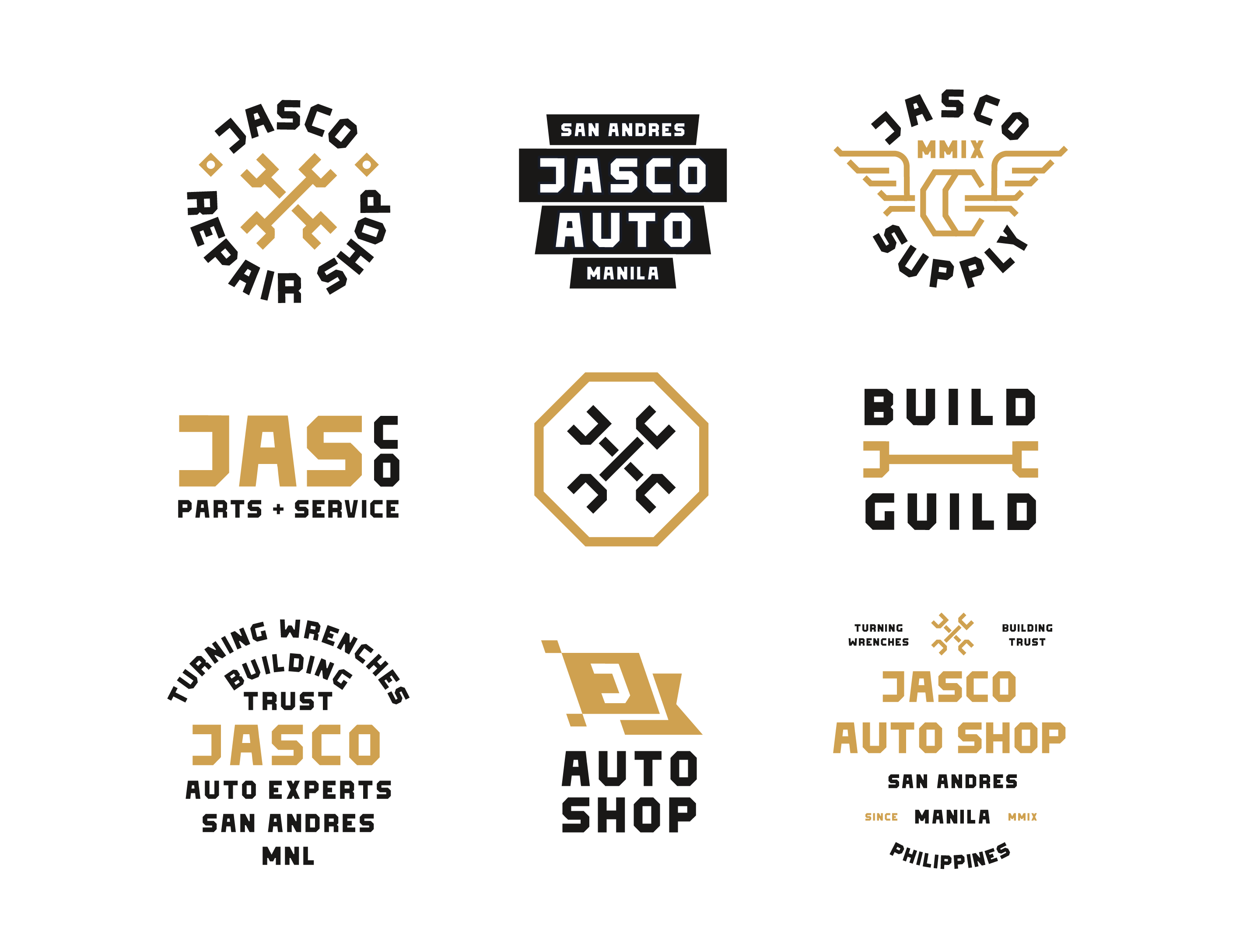
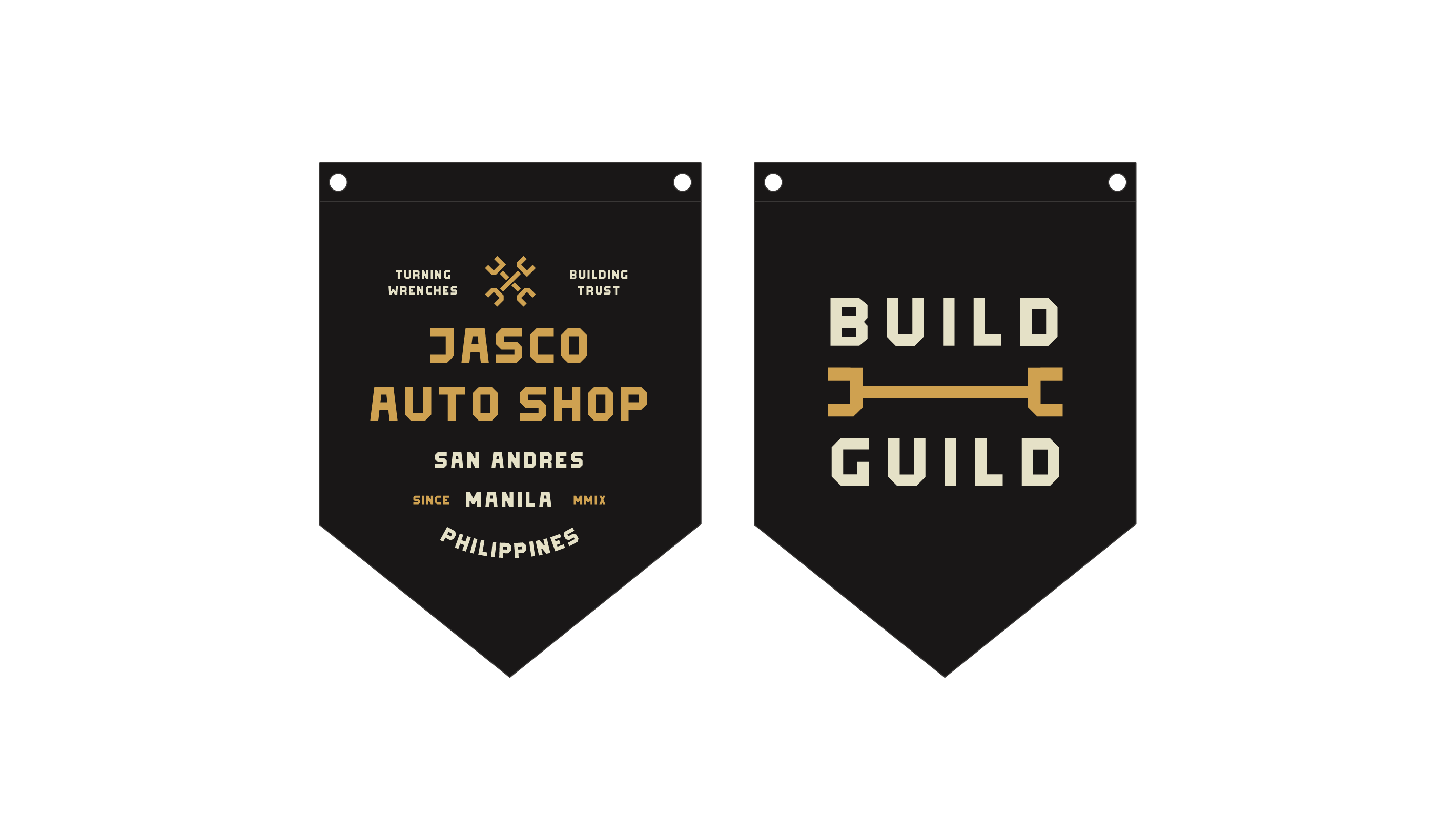
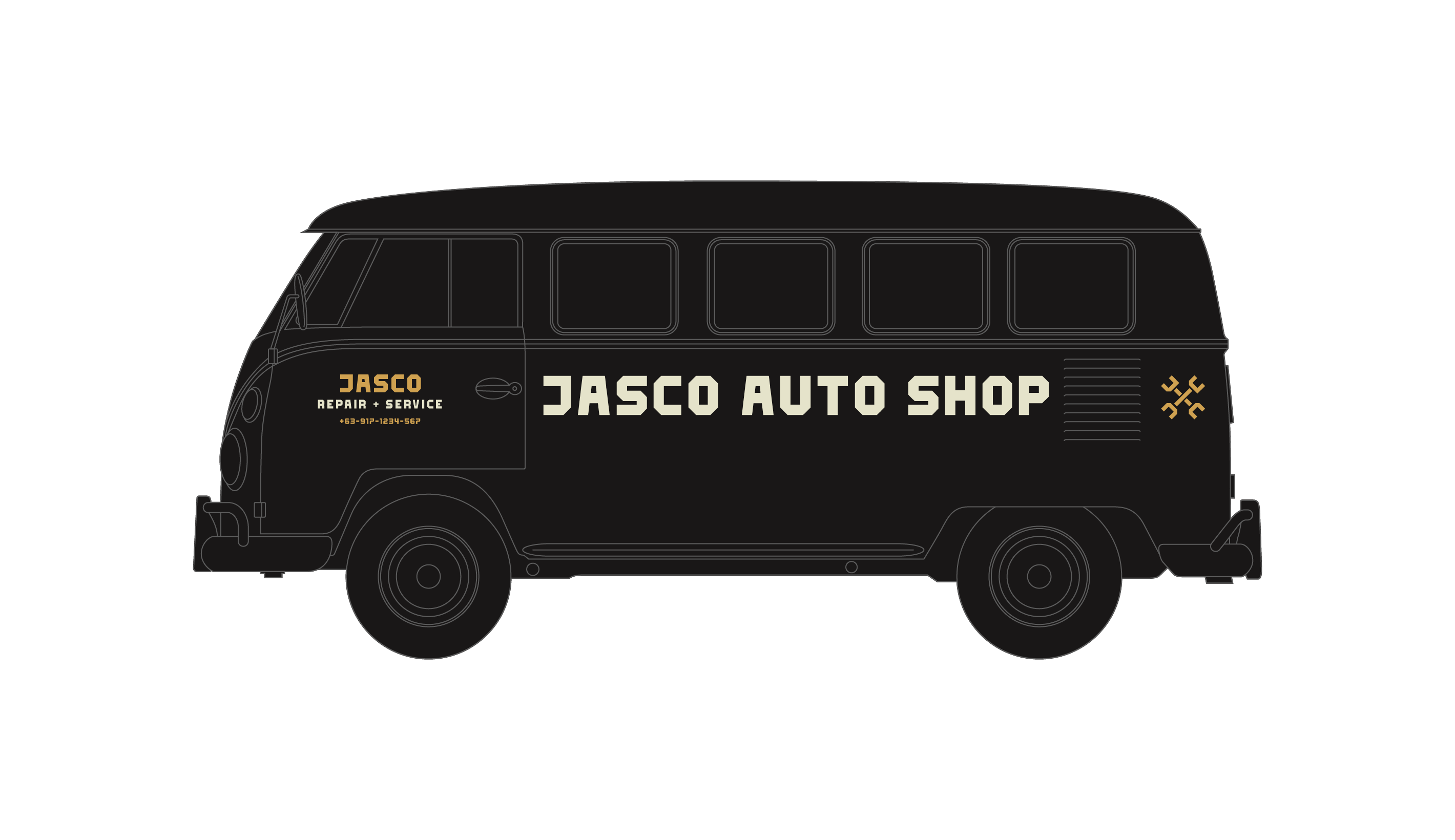
The JASCO symbol is crafted with intention, combining elements of craftsmanship and personal identity.
Wrenches are well-known tools in the automotive repair industry. The use of this tool as the logo’s foundation represents the dedication and craftsmanship that JASCO brings to every vehicle it touches.
The initials “J” and “C” stand for the name of the brand’s owner. A personal touch that gives the logo authenticity and a sense of ownership. This personal connection gives the brand a human touch, recognizing the owner’s genuine passion and commitment.
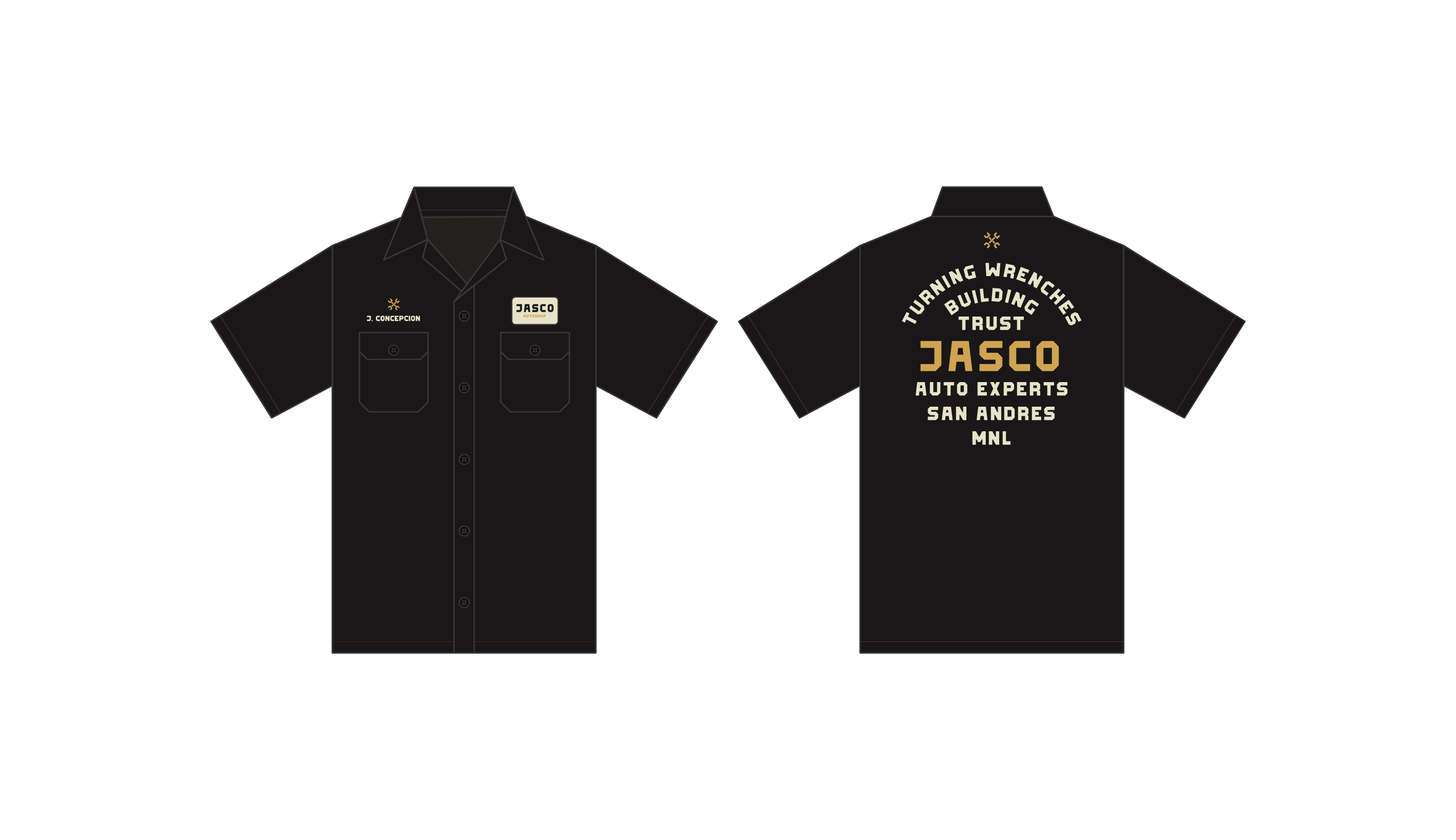
This deliberate design creates a visual identity that communicates the brand’s mission – turning wrenches and building trust.