Sierra Real Estate
Year:
2023
Client:
Trinity
A design exercise for a real estate company with the objective of creating a visual identity tailored to a real estate agent embodying the Sage brand archetype.
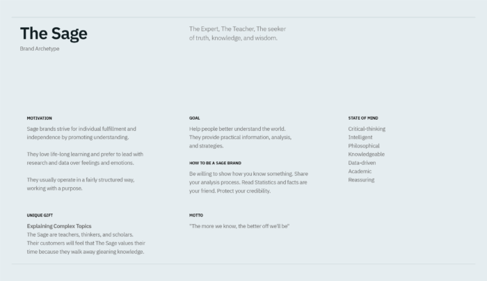
The Sage archetype is one of the 12 personality archetypes originally created by Carl Jung. This concept was popularized by Carol Pearson and Margaret Mark in the field of branding and marketing. It was used to represent a brand as a persona based on the 12 human desires and values.
In this project, the Sage archetype serves as the guiding narrative, influencing the direction and execution of my design process in order to create a visual identity that captures the essence of a Sage-like brand.
Crafting an appropriate visual identity that resonates with a brand and embodies its archetype is an important aspect of brand strategy. To achieve this, it’s essential to dive deep into understanding the brand’s values and personality.
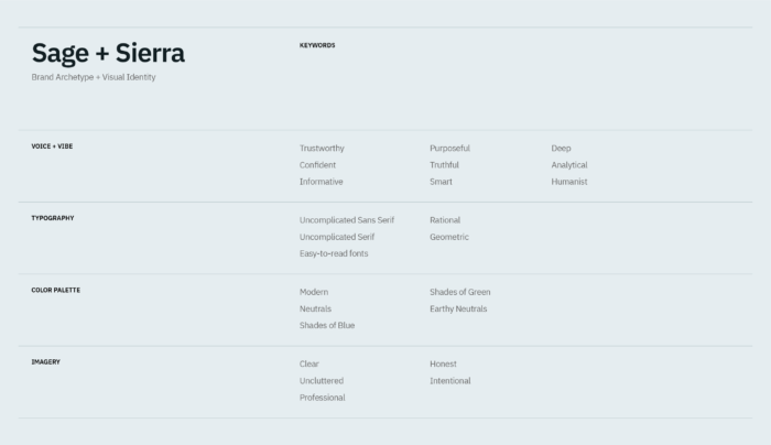
After understanding the Sage brand archetype, I translated the Sage values and attributes into different keywords to create a strategic framework that not only guides my design decisions and process but also ensures that the design elements communicate the essence of the brand archetype.


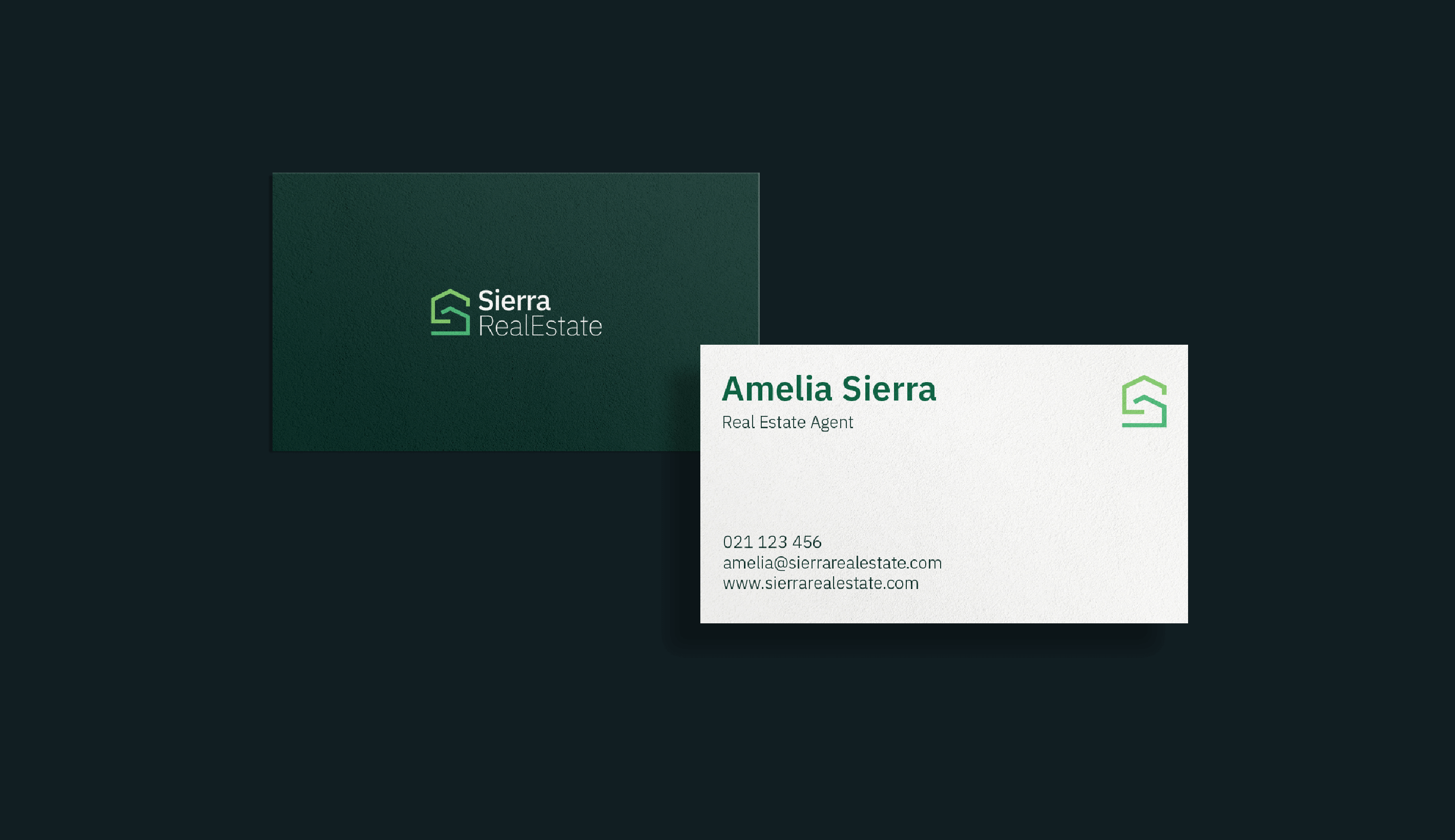
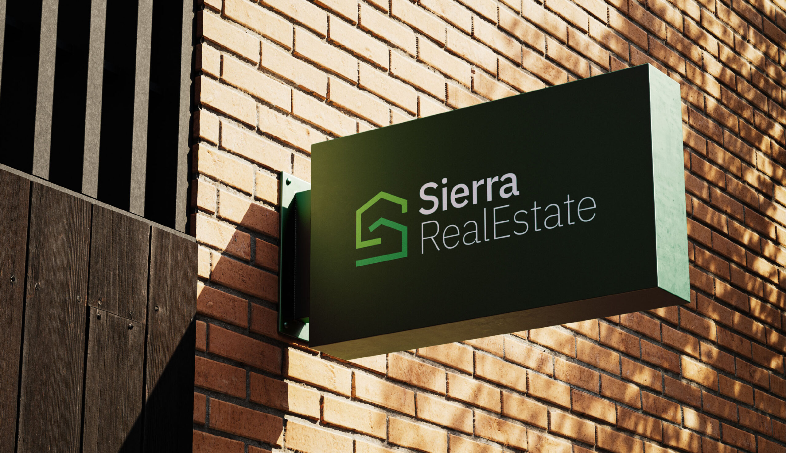
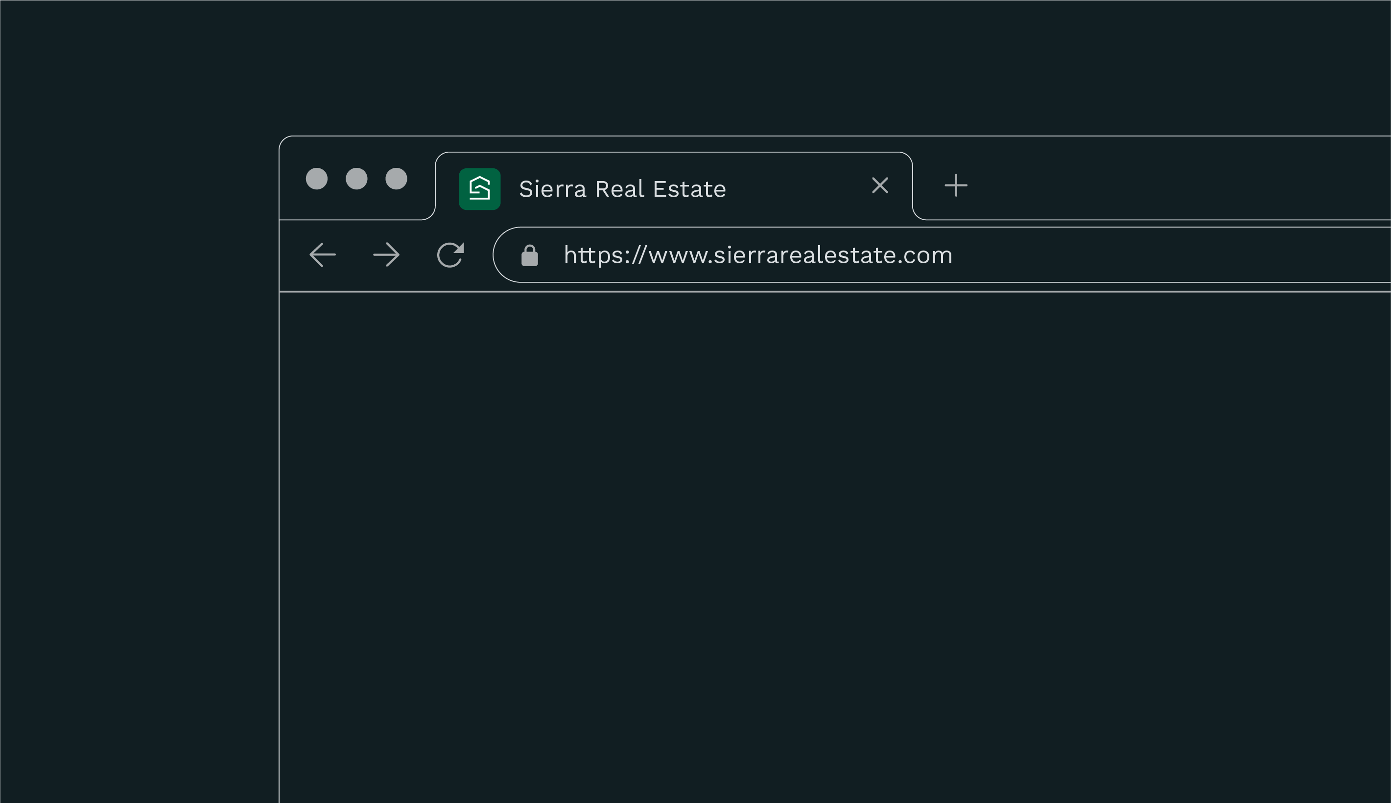
SYMBOL
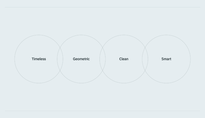
For the symbol to be timeless and easier to remember, it has to be simple yet distinctive. A quick glimpse of the symbol should trigger a connection in the poeple’s mind.
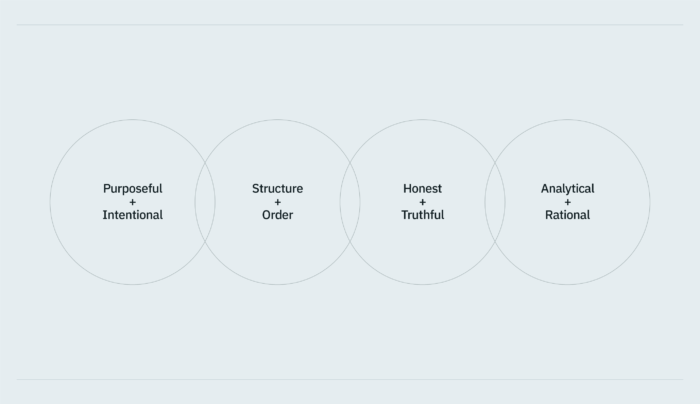
Honest + Truthful
The use of the brand’s initial and form of a house shows the essence of who the brand is and what it offers.
Structure + Order
Geometric shapes or straight lines are often associated with balance and order. They also communicate a sense of reliability and structure, which are characteristics associated with the Sage archetype.
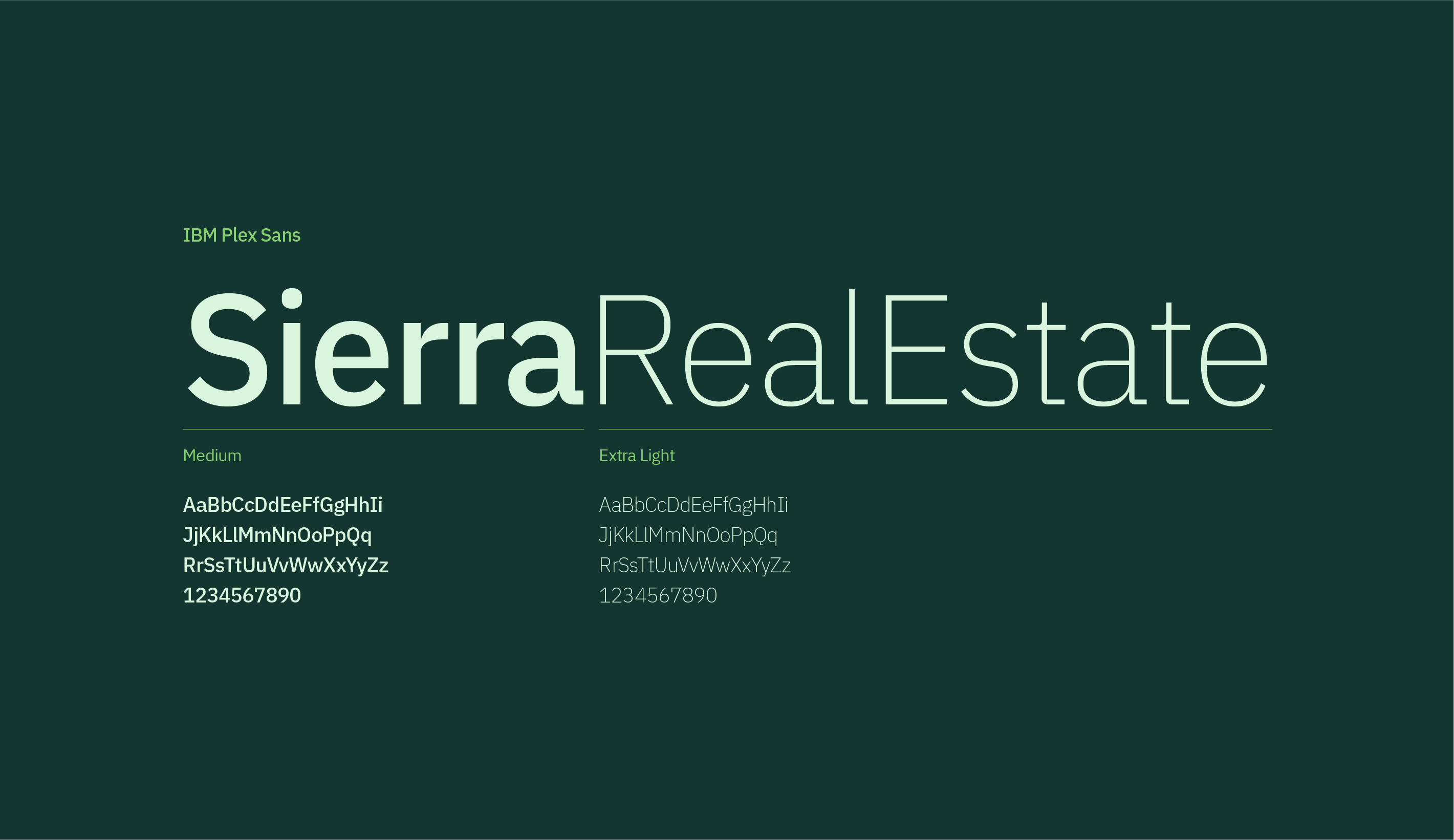
TYPOGRAPHY
Purposeful + Intentional
In choosing a font, I opted for IBM Plex Sans by IBM. I think it resonates well with the values and historical significance associated with a Sage brand. IBM Plex Sans itself embodies the essence of a Sage brand, aligning closely with principles of knowledge, science, and innovation. Its development was informed by the rich heritage of the IBM brand, reflecting the Sage-like approach of drawing from history for wisdom. Many aspects of the font’s design were thoughtfully influenced by IBM’s design history, mirroring the purpose-driven nature that defines a Sage brand, where decisions are made with profound intent and clarity of purpose.
A Grotesque Typeface
This style came about during the Industrial Age. Grotesque typefaces balance human and rational elements. Solid, bold designs suitable for headlines and advertisements.

COLOR PALETTE
Industry Colors
Based on the data visualization by 99designs and MH Designs. Blue is the favorite color of the real estate industry.
“Over two-thirds of industry-leading logos feature blue…But other colors make a strong showing: green, for example, is requested about 26% of the time in briefs for real estate contests…”
To stand out from the industry where blue is often the dominant color choice, I opted for green to create a more distinct and memorable identity. While blue is a popular and widely used color in the industry, its ubiquity can lead to less differentiation and lower brand recall.
Green also aligns perfectly with the Sage-like qualities that the brand embodies: wisdom, knowledge, and guidance.
Color Psychology: Green
Green is often associated with harmony, stability, reliability, and knowledge. It also aligns with the concept of growth and new beginnings.
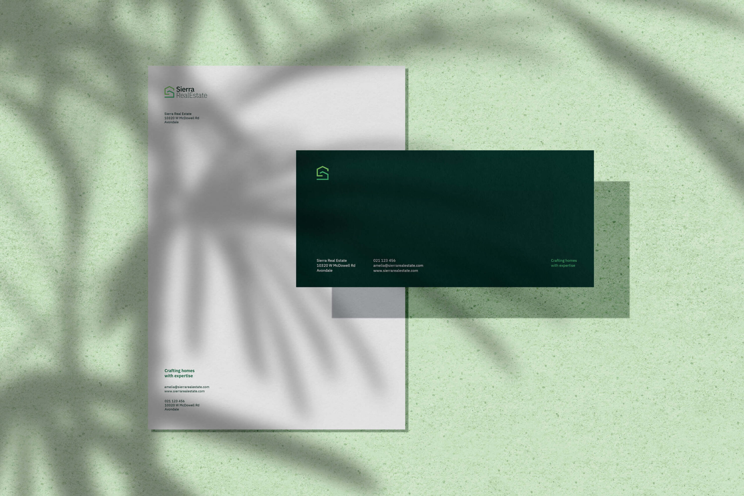
Monochromatic
A monochromatic palette allows for a clear and uncluttered design, enhancing the logo’s legibility and making it easier for viewers to understand and remember.
The lack of distracting colors allows the logo to communicate its message with elegance and precision.
This also aligns with the Sage archetype’s focus on clear thinking and rationality.


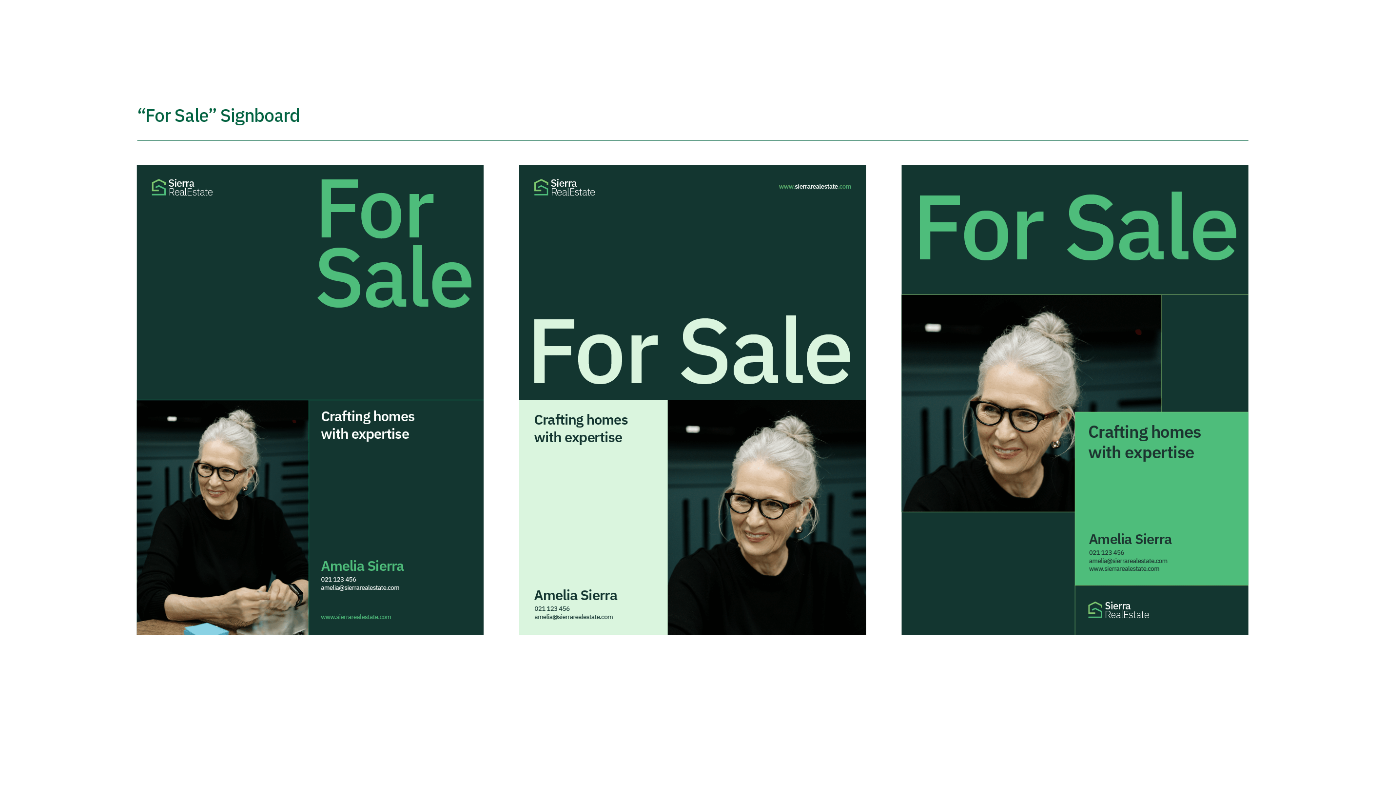
LAYOUT
Structure + Clarity
Grid layouts provide a clear and consistent structure that helps establish a strong visual hierarchy. This is important for a Sage brand as it reflects the archetype’s wisdom and ability to distill complex information into easily digestible components. The grid layout allows to prioritize and present content in a logical sequence, making it easier for the viewers to absorb and understand.
Sage brands often seek to communicate their message with clarity and simplicity. The grid layout supports this by offering a clean, organized design where information is compartmentalized. This reflects the archetype’s inclination towards imparting knowledge in a straightforward and approachable manner.